The customer service I received was motivating and encouraging

Raise Your Hand If You Found Something New
The School Library
High Point Academy is a free, state-funded, public charter school, founded in 2014. The school serves students in Kindergarten through 12th grade and is a member of the South Carolina Public Charter School District. High Point Academy is located in large facility formerly occupied by a shopping mall. The shared library service for grades K – 12 at High Point Academy is administered by Librarian, Katie Nestberg. Katie accepted the job at High Point Academy in 2014 in the opening year of operation. At the time, the still newly acquired facility did not yet have a space on the campus finished appropriately to house a library. Katie was nomadic, having little more than a rolling cart and a storage closet where she kept her supplies between her class visits. In October of 2017 Katie’s principal surprised her with a new dedicated library space and a directive to get the library up and running quickly.
The Challenge
While Katie was delighted to receive the new space for her students, she soon became keenly aware of the vastness of her new 5000 square foot library and the absence of furnishings appropriate for the school’s 13 grades and 1400 students. She needed to decide how to arrange her library space, what type of furniture she would purchase and identify a vendor that could provide the furniture before the upcoming spring open house event on March 20th 2018. Katie would only be purchasing furniture for the K-5 Section of her library in the first year, but would need to ensure that she had enough shelving for a book collection that was certain to grow by approximately 200 books per year for the next several years. She needed the design and the furniture to be timeless, functional and flexible.
The Connection
Katie began searching for product vendors that could help her kick off her project. She reached out to a large, well-known library supplier, but struggled to get a return phone call from their call center. She wasn’t familiar with Opening the Book, but reached out to them too because she found the children’s library furniture and sample floor plans on their website and in their catalog to be unique and attractive. She was initially hesitant to use a smaller, lesser known company like Opening the Book, but soon found that the level of hands on service was unparalleled. She was surprised by their free design service and attention to detail.
The Design
Opening the Book designed a plan for the High Point Academy library that covered Katie’s shelving and seating requests present and future. The school only had the budget available to furnish the elementary section of the new library, but Katie wanted assurance that the furniture she chose now would be part of a cohesive master plan, which would be fulfilled when the funds became available to finish the high school side of her library. Katie liked the curved Discovery Layouts she saw in other Opening the Book plans. She noted the need for a space that would visually create three distinct zones; a somewhat traditional “book-centric” elementary library with lots of bookshelves to explore and a cozy story corner with space for her young students to spread out or work in small groups.
On the high school side of her room, she requested a learning commons model, where students would have lots of comfortable seating options, access to power for charging, collaborative work spaces and mobile shelving. In between the two distinct age zones, would be a commonly used work table area. Opening the Book designers listened closely to Katie’s visions and produced a floor plan that met her requirements. To help her with her presentation to the school board Opening the Book equipped her with 3D drawings of the new proposed space, which empowered her to make a compelling visual presentation when requesting fund approval.
The School Library Furniture
Planning for an evolving space was immanent so Opening the Book recommended that all of the mid-floor shelving be mobile. Straight, 48” BookSpace Mobile Bookcases were perfect for K-5 Students. The BookSpace Mobile Bookcases came standard with unique adjustable and reversible shelves, which made it easy to configure the bookcases for large picture books or smaller fiction. Comfortable hub seats were chosen for the centers of the bookcases to create the propeller shapes in the floor plan and to add interesting seating areas near the books.
In addition to providing High Point Academy with a custom library design and unique library furniture, Opening the Book shared helpful merchandising tips and techniques to ensure that the school and the students would get the most of their new bookcases and the yet undiscovered new reading choices that they hold.
Katie wished for a dedicated story time corner for her youngest students. Again, integrating the seating closely with the books was important to her. Opening the Book designed a corner using 3-Tiered Picture Book Displays, a Corner Seat and comfortable, cushioned Storage Seats. Katie also added two free standing, Double-Sided Book Pods for her space to provide a differentiated way to display featured books based on curriculum or school themes.
What do the High Point Academy students say?
On March 8th Katie Nestberg welcomed the first elementary class into the updated library space to explore. The whispers of wonderment began as the second grade students entered the space. “Whoa.” “Wow.” Cool.” “I thought you said it was only a little different, Mrs Nestberg?” Katie gave the students 10 minutes to explore.
The students wove in and out, exploring of the new bookcases before Katie gathered them all in the new story area. “Raise your hand if you found something new today,” Katie asked. The entire class raised up their hands. “Tell me something new you found,” Katie said and began selecting students to share. “Dogman!”” Descendants!” “Dork Diaries!” “Creepy Carrots!” the students answered. Mrs. Nestberg, surprised, whispered back to the students, “Those are same books we already had! Look at all of the books you found for the first time today!”
"I was surprised by how much the subtle tilt of the Opening the Book shelves created greater visibility of the book spines for the students"
“Thank you so much for your quick work regarding the 3D drawings. They were very helpful when I was making my initial presentation to my superintendent. When I looked at the plans, I felt very heard and understood because of the counter height areas, the story area, common learning areas and overall flow of the room. I love how you use the support columns as an advantage, not a distraction or dividing point. There are so many smart details included in the drawing. I am enthusiastic about the overall plan.” ~ Librarian, Katie Nestberg
More Case Studies

Walnut Grove Media Center Design
Take a visual tour of the new Walnut Grove Elementary Media Center.
View
Reimagining the Riviera Beach Public Library
Learn how the interior of the Riviera Beach Public Library was reimagined to be a state-of-the-art, unique facility for their community to use and enjoy.
View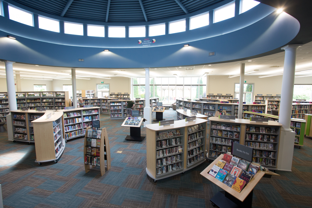
Niagara-on-the-Lake Public Library
Learn how the interior design at Niagara-on-the-Lake Public Library seeks to balance the needs of different communities harmoniously in one library.
View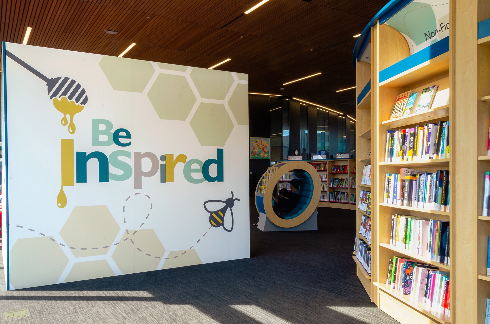
Revolutionary Library Design
New library buildings often end up with traditional library interiors. The story of Milton Public Library's Sherwood Branch shows how the shelving layout at the core of every library can be re-imagined to match the building aspirations. Get this right and both footfall and circulation will out-perform all expectations!
View
Elementary School Library Makeover
Read on to learn how Opening the Book designed a school library to be the flexible, functional space that they needed.
View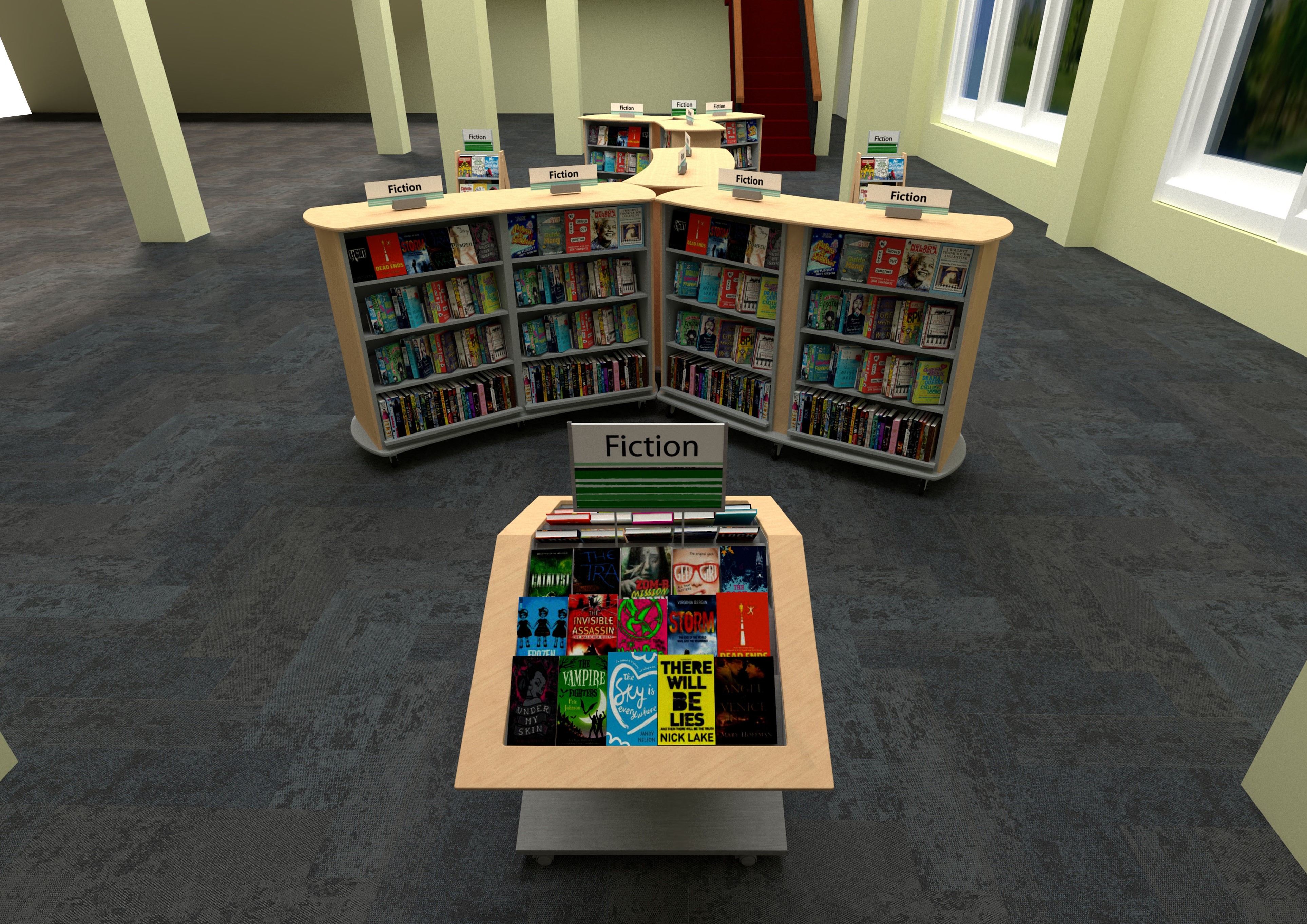
Library Entryway Design
Learn how Opening the Book designed a library entryway to create an impactful first impression and showcase their new materials collection.
View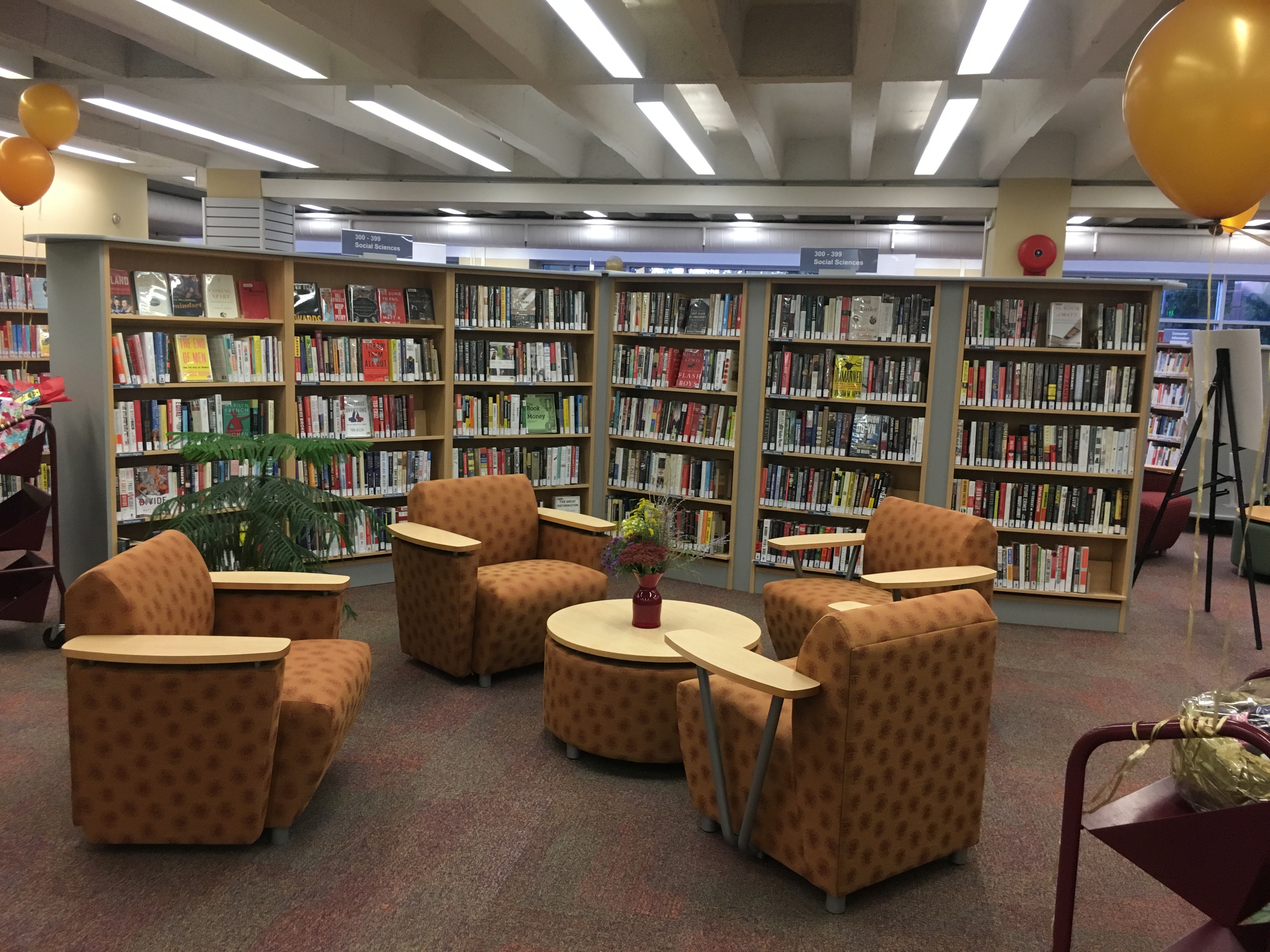
Creating Browsing Neighborhoods
How Opening the Book supported one library’s move to replace Dewey with friendly neighborhoods of related subjects.
View
Animating a Children’s Library Space
Breathing new life into a children’s library that had gotten a bit tired ….
View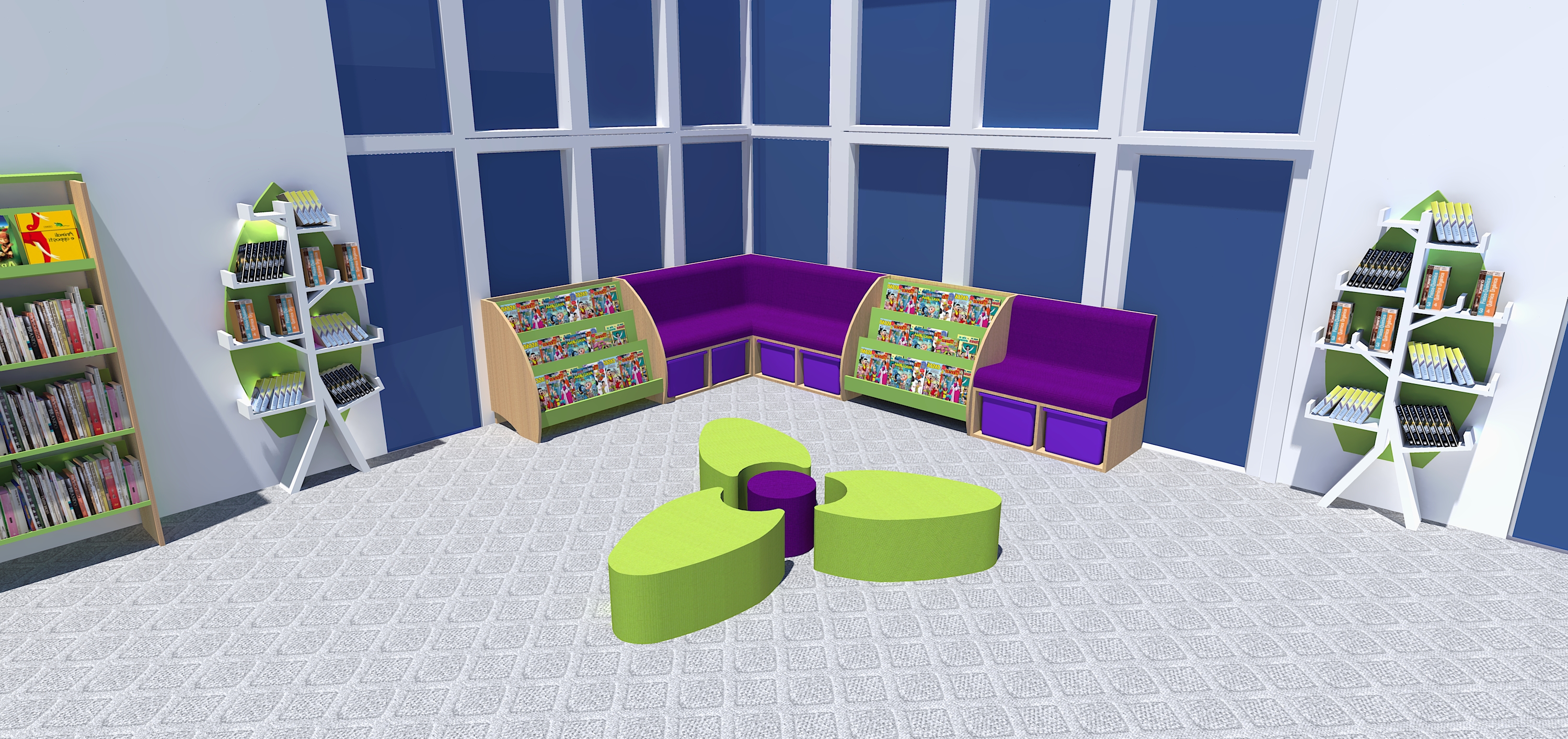
The Heart of a Texas School Campus
Balancing functionality and budget with jaw-dropping features – and all turned round in a week!
View Canada
 United States
 United Kingdom


